We just shipped one of the biggest changes to webshot.site since launch: four distinct capture modes that let you tailor every screenshot to your exact use case.
Until today, every capture was the same thing: a full-page desktop screenshot at 1920×1080. That's great if you need to see everything top to bottom, but it's overkill for most use cases — and for responsive sites, it doesn't tell you how things actually look on a phone.
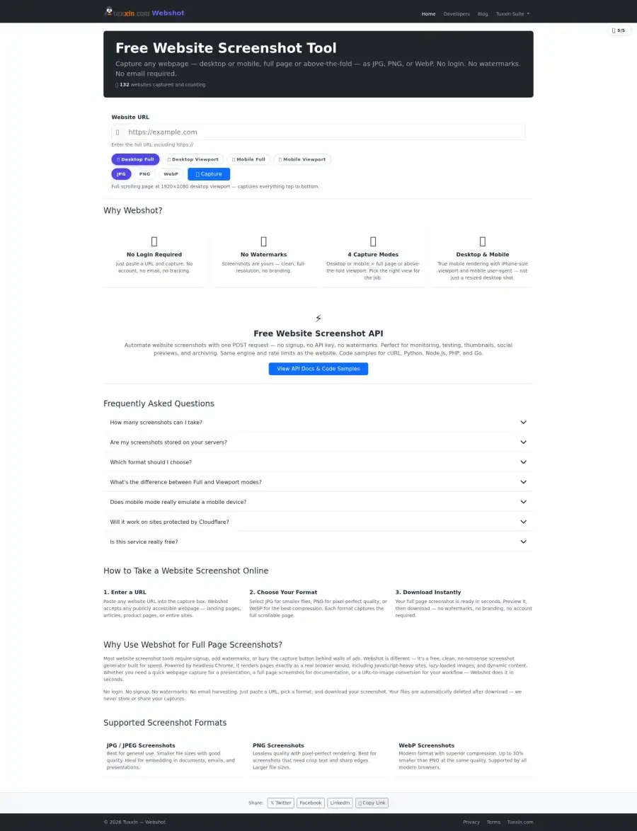
Starting now, you can pick from four modes in the web UI or pass a mode parameter to the API:
The four modes
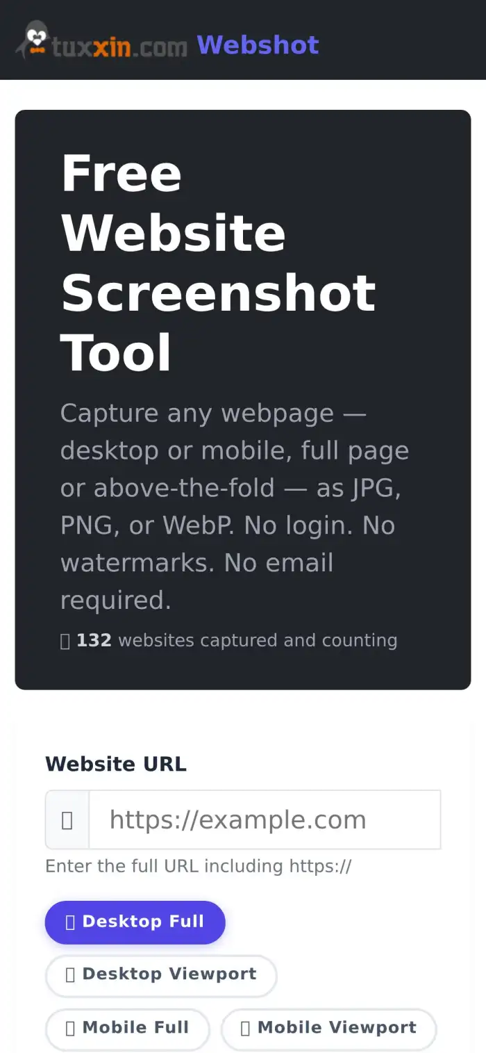
🖥️ Desktop Full (default)
The classic: the entire scrollable page captured at a 1920×1080 desktop viewport. Use this when you need to see the whole thing — footer, legal boilerplate, lazy-loaded content, everything.
- Viewport: 1920×1080
- Output: often tall (6000px+ for content-heavy sites)
- Typical time: 5–10 seconds
- Best for: full-site archival, change detection, legal documentation
🖥️ Desktop Viewport (new)
Just the above-the-fold view at 1920×1080. Clean, consistent dimensions, roughly half the file size and half the capture time of full-page mode. This is the mode most people actually want 80% of the time — hero thumbnails, social cards, link previews, PDF report headers.
- Viewport: 1920×1080 (exactly)
- Output: always 1920×1080
- Typical time: 3–4 seconds
- Best for: thumbnails, social previews, report headers, dashboards
📱 Mobile Full (new)

Full scrolling capture at a 390×844 iPhone 15 Pro viewport with a 3× device pixel ratio, a mobile Safari user-agent, and touch event support. Sites see a real mobile browser, not a shrunk-down desktop — so responsive layouts, hamburger menus, and mobile-only content all render correctly.
- Viewport: 390×844 CSS pixels at 3× DPR
- User agent: iOS Safari
- Typical time: 8–15 seconds (mobile sites can be longer)
- Best for: auditing mobile UX, mobile screenshot archives, responsive testing
📱 Mobile Viewport (new)
The 390×844 above-the-fold view on mobile. This is the fastest, smallest capture we offer. Perfect for mobile app store screenshots, mobile hero thumbnails, and consistent mobile previews across lots of different sites.
- Viewport: 390×844 CSS pixels at 3× DPR
- Typical time: 3–4 seconds
- Best for: mobile thumbnails, responsive QA, consistent mobile dashboards
Why viewport mode matters for PDF reports and dashboards
The single biggest reason we built viewport mode: consistent dimensions. If you're building an SEO dashboard, a screenshot monitor, or monthly PDF reports that include hero images of dozens of sites, full-page mode is a nightmare — some sites are 2000px tall, others are 30,000px tall, and every report layout looks different.
Viewport mode fixes that. Every desktop viewport screenshot is exactly 1920×1080. Every mobile viewport screenshot is exactly 390×844 (or 1170×2532 at native DPR). Your report layouts stay clean, your thumbnails crop consistently, and your users get a professional-looking product.
This is exactly why we built it — a sister project needed clean viewport captures for monthly PDF reports. Instead of building it in isolation, we added it to webshot.site so everyone can use it for free.
Using it
Web UI
Just pick your mode in the button row above the URL input on the homepage. The mode you select is remembered for subsequent captures in the same session.
API
Pass a mode parameter in your POST body alongside url and format:
curl -X POST https://webshot.site/api/capture \
  -H "Content-Type: application/json" \
  -d '{
    "url": "https://example.com",
    "format": "webp",
    "mode": "desktop_viewport"
  }' \
  --output hero.webp
Valid values for mode:
desktop_full— full scrolling desktop (default)desktop_viewport— above-the-fold desktopmobile_full— full scrolling mobile with mobile UAmobile_viewport— above-the-fold mobile
Omitting the mode parameter defaults to desktop_full for backwards compatibility — every existing integration continues to work exactly as before. The response now includes an X-Webshot-Mode header echoing the mode used.
Full API docs, code samples for Python/Node/PHP, and rate limit details are on the developers page.
Related reading
- Generate OG:Image Previews for Any URL with One API Call — viewport mode is a natural fit for social preview images.
- Website Screenshots: WebP vs PNG vs JPG — Which Format is Best? — pair your capture mode with the right output format.
Still free, still no login
The same rate limit applies across all four modes — 5 captures per 15 minutes per IP. No login, no API key, no upsell. Viewport captures actually consume less server resources than full-page captures, so we're hoping most traffic will shift to the faster modes naturally.
Try it out on the homepage and let us know what you build. Happy capturing.